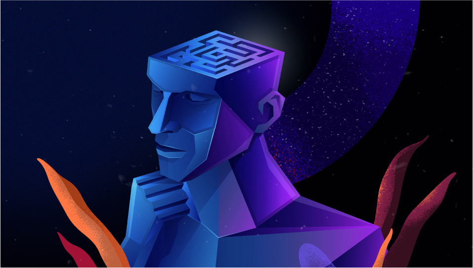
Why some designs attract your eyes and makes your heart race, can be explained scientifically. Humans have sluggish, prejudiced, and shortcut-prone brains. It may be the fault of a lazy brain, but user experience research on human cognition may be sloppy, unreliable, and full of unfounded assumptions. Due to the complexity of cognition, gut feelings or first impressions are influenced by several factors.
While traditional research techniques like observation and interviews frequently require the UX researcher and participant to make educated guesses, contemporary technology like eye tracking enables researchers to investigate almost undetectable behaviors and preferences.
The width of a button or the color contrast of text are two seemingly little factors that, in the event of items with high traffic, might differ by millions of dollars. In order to better understand how their products are used, tech behemoths like Facebook and Google are starting to apply neuroscience-based methods. Let’s begin by defining reactive, “Fast thinking,” and then offer some advice for designers on how to best harness the power of neuroscience to produce fantastic user experiences.
Fast and Slow Thinking in Design Psychology
It is no secret that the subconscious controls a large portion of human behavior. Millions of neurons fire in the milliseconds that follow a person using a new app or website, and their brains make hundreds of subconscious choices like “Am I where I should be? Can I trust this website?”
People create aesthetic reactions to a web page in the first 17 to 50 milliseconds following exposure, according to research by YouTube UX Researcher Javier Bargas-Avila 2012. To put it into perspective, the blinking time for an eye is 300–400 milliseconds. In quicker than the blink of an eye, your product might be tried, found guilty, and sentenced.
Although these impressions might not be seen, they have an effect on behavior. For instance, if a site opens slowly and the user’s brain interprets the first items to appear as being “off-topic,” they may choose to leave the site right away rather than waiting for it to load.
System 1: Swift, frequent, instinctive, emotive, stereotypical, and subconscious. Reactive system 1 thinking is in charge of sophisticated yet automatic cognitive processes like estimating distances between things or predicting emotional reactions. System 1 thinking is often the default mode in your sluggish brain.
System 2: Laborious, slow, rational, calculated, aware, rare. System 2 thinking is analytical and used in more complicated situations, such as choosing the proper social conduct or contrasting two items with various costs and features.
Much of human decision-making falls under System 1, or “Fast thinking,” since the brain doesn’t want to re-process information or make innovative conclusions every time it is presented with a new circumstance. Schemas or mental models—familiar patterns of information and interaction—can be overused by the brain while making hasty judgments. System 2 never takes over when System 1 thinking is active. Although people may not be aware of it, their brains’ shorthand for making decisions significantly influences their behavior and how they perceive the product.
Even though it only makes up roughly 2% of the body’s mass, the human brain uses a staggering 25% of its oxygen supply. The brain is lazy as a survival mechanism because shortcuts and pattern recognition require less mental effort than conscious thought. When something is identified, it is given a name before being ignored until it becomes important again.
Although the brain’s predilection for patterns and careless decision-making may make survival simpler, they also make UX design more challenging.
A few neuroscience methodologies have recently transitioned to UX research, assisting researchers in illuminating the factors that trigger “Fast thinking.” With the use of eye-tracking cameras, attention and perception may be examined.
Skin sensors or face analysis can be used to measure arousal and emotional reaction. Electroencephalography can be used to gauge the brain’s electrical reaction.
It may seem hard to designers to hold someone’s attention and transmit important information in less than a second. Fortunately, much as neuroscience may aid with issue diagnosis, it can also provide broad answers and best practices. Here are a few broad insights that designers may utilize when creating digital goods, drawn from research on neuroscience user experience.
Simple it up
Each person has certain preconceived notions about how a website or app should seem when they first visit it. Design professionals might gain from quick subconscious decision-making by adhering to that expectation.
When someone opens your app or website, they want to know two things: (i) Does it include what they are seeking; and (ii) Is it of excellent quality? People can find their way around more easily when designs are kept basic and brands, services, and goods are placed prominently.
A piece of information should not be crowded out by other information while it is front and center. Just as crucial as rearranging elements is decluttering a design.
Tech businesses are moving toward creating interfaces that are more straightforward and uncluttered. Task completion rates for these simple designs are higher than those of more complicated designs, and research has shown that aesthetic appeal influences both online and offline purchase decisions. The performance of aesthetically straightforward and tidy designs has been scientifically shown. The objective of the website is immediately clear to the lazy intellect, who knows exactly what to do.
Signal Upcoming Events
The user’s capacity to comprehend and respond to new information can be enhanced through priming, or preparing someone for some impending knowledge or encounter. Someone can be trained to anticipate things like UI components, certain interactions, or process time. For instance, Yelp employs a separate screen to inform consumers when they are about to leave Yelp and visit a different website. The added context aids in informing the user that a fresh design and information architecture are to be expected. A two-edged sword is priming. Decision-making can nonetheless be influenced by the information you did not want to convey. For instance, if your photography business solely sells images of newborns, someone could mistakenly believe that you only work with infant clients.
Prepare for Reckless Readers
Studies using eye-tracking technology can measure a person’s gaze as they use a product. They can create heat maps that depict the amount of time spent concentrating on one area of the screen or maps that depict the eye’s movement as it hops across the page. We are aware that the brain frequently looks for information using an F-pattern, regardless of the industries or types of apps (or E-pattern). The reader scans the page for pertinent information or icons after reading to the right after looking at the material at the top.
A Nielsen Norman study of 45,237 page views found that only around 20% of the material on a page is really read by the reader. Even worse, visitors to sites with greater information only spent an extra 4 seconds on each additional 100 words of text.
Nielsen Norman uses the following principles for scannable text in a world where people don’t read word-for-word.
- Key phrases in bold
- Subheadings with substance
- List with bullets
- A paragraph should only include one concept.
- Starting with the conclusion in the inverted pyramid format
- Less than half the word count of traditional writing
Utilize contrast and vibrant colors
Design considerations go beyond only how the text is organized and where it is placed. Users’ attention may be drawn using color theory, weights, and contrast.
Contrast and brightness are only the beginning. According to color theory, your product’s colors should be balanced by employing the dominant color 60% of the time, the secondary color 30% of the time, and the accent color 10% of the time. The neurobiology underlying what attracts the eye is supported by this breakdown. The accent color stands out the greatest since it is utilized the least.
Just as using a bright hue might grab the viewer’s attention, using a more subdued color can make it easier for the viewer to tell whether the information is extraneous or less significant. To distinguish them from the rest of the content on the page, most websites, for instance, utilize footer portions in a more neutral color.
Gut Check
Fortunately, you don’t need expensive eye-tracking tools or an electroencephalogram to determine whether a design is effective. A useful test to see if your ideas are immediately intelligible is the 5-second test. A 5-second test involves seeing a website or app for 5 seconds before answering questions regarding the content and design. Without being able to go back to the visual, the participant shares their “impressions” of the product, including what they would do or where they would search for the next steps. Even if your product has all the features your consumer wants, if the lazy, pattern-loving brain can’t understand that right away, it will go on.
Conclusion
Design conventions in the business will continue to shift as we learn more about design psychology, the brain, and perception. The common denominator is data; as approaches to studying neurology and cognition advance, so will the kind and caliber of data that can be used in UX design.
Management consulting is increasingly embracing design thinking, but it is crucial that those tasked with improving organizations in a future-focused manner “keep in mind” how the human brain processes information, makes choices and makes choices in decision making.